Web Designing Coimbatore
- Web Design service in Coimbatore
Creating Websites for Every Device - Responsive Designs Across Different Computing Platforms
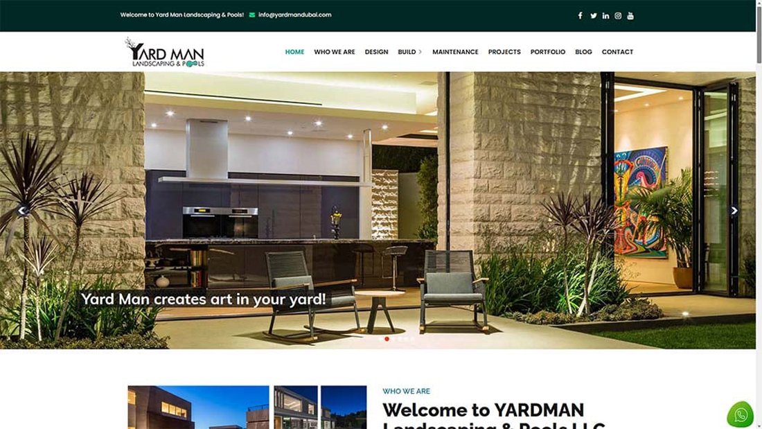
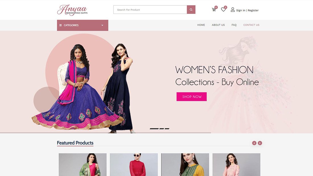
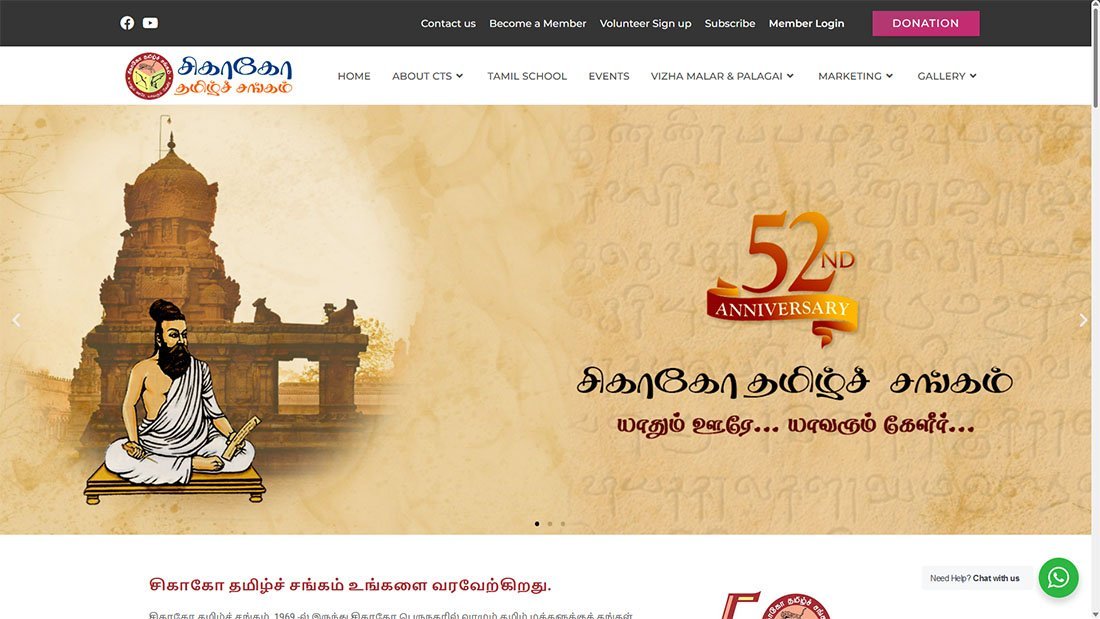
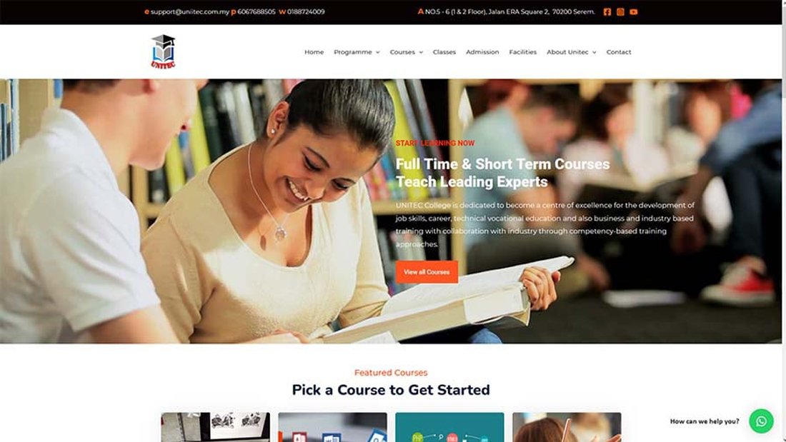
ADVAITECH Web Solutions is recognized as a premier Responsive Website Design Company in Coimbatore, committed to developing websites that smoothly adjust to a variety of devices and screen sizes. Our proficiency is in establishing user-friendly interfaces, ensuring uniform functionality, intuitive navigation, and optimal viewing experiences on platforms ranging from desktops and laptops to tablets and smartphones. By employing advanced techniques such as flexible grids and fluid layouts, we create websites that dynamically adapt to diverse screen resolutions, ensuring a cohesive and compelling user experience across all devices.
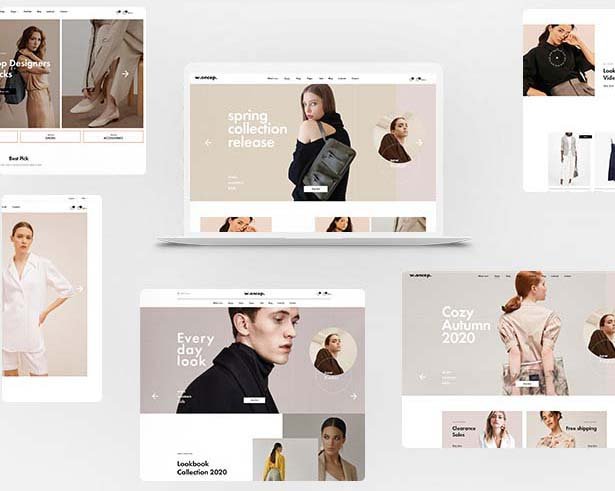
Advantage of Mobile and Responsive web Design
Responsive web design has become essential in the era of diverse devices and screen sizes. It not only improves user experience but also helps with search engine optimization and reduces development costs by providing a unified solution for multiple platforms. Responsive web design offers several advantages, making it a popular approach for creating websites. Here are some key benefits:
Advantage of Mobile and Responsive web Design
Define the Purpose and Goals:
- Identify the purpose of the website.
- Define specific goals and objectives.
- Understand the target audience.
Research:
- Conduct market research.
- Analyze competitors’ websites.
- Gather content and information relevant to the project.
Planning:
- Create a site map outlining the structure and navigation.
- Develop a wireframe or mockup to visualize the layout.
- Plan the user journey and interactions.
Design:
- Create the visual design based on the wireframe.
- Choose color schemes, typography, and imagery.
- Ensure the design aligns with the brand identity.
Development:
- Write the code for the website.
- Use HTML, CSS, and possibly JavaScript for front-end development.
Implement any required back-end functionality (e.g., database integration, server-side scripting).
Content Creation:
- Develop or gather high-quality content (text, images, videos, etc.).
- Optimize content for search engines (SEO).
Testing:
- Conduct usability testing to ensure a positive user experience.
- Check for cross-browser compatibility.
- Test on different devices (desktops, tablets, mobile devices).
- Validate code for compliance with web standards.
Launch:
- Choose a hosting provider and launch the website.
- Set up domain and hosting configurations.
- Ensure all elements are working correctly.
Post-Launch Maintenance:
- Monitor website performance.
- Fix any bugs or issues that arise.
- Regularly update content and ensure security measures are in place.
Analytics and Optimization:
- Set up analytics tools to track website performance.
- Analyze user behavior and make data-driven optimizations.
- Continuously improve the website based on insights gained.
- Packages
Web Design Price & Package

Landing Page Website
- Domain
- Hosting
- Premium SSL
- 7 Full Page Section
- Mobile & Responsive
- SEO Layout Design
- Basic SEO
- WhatsApp Chat
- Google Map
- Social Media Integration
Premium Website
- Domain
- Hosting
- Premium SSL
- 20 Pages Including Home Page
- Inner Page Template Design
- You can add unlimited pages
- wordPress (CMS)
- Website Control Panel Login Details
- Responsive & SEO Layout Design
- Add/edit /delete Pages
- Blog Page Setup
- Photo Gallery Page
- Video Gallery Page
- Testimonial Page
- On-Page SEO to all Pages
- Google My Business Integration
- Google Analytics Seup
- Google Submission
- Basic SEO
- Google Map
- Create Social Media Accounts
- Create Social Media Pages
- Facebook Post feed
- Instagram Post feed
- WhatsApp Chat Setup
- Call Button Setup
- 90 DAYS WEBSITE SUPPORT

Business Website
- Domain
- Hosting
- Premium SSL
- Website Control Panel Login Details
- Customized Responsive Design
- 7 Pages Including Home Page
- Enquiry Form
- Google Map integration
- Google Submission
- Enquiry Form
- Basic SEO
- WhatsApp Chat
- Social Media Integration
- SUPPORT:
- +91 98948 77714
- +91 82489 04571
- info@advaitech.com